(Click here to see image full size)
Metro’s focus has always been how to provide to you, our readers, the best possible experience when you pick up your copy of Metro.
As you turn the pages today, you will notice a cleaner, modern, sophisticated, well-organized look. This design has been a year in the making. We changed the navigation of the paper to make it easier for you to find exactly what you are looking for. Each section is designated with a distinct color that plays off of our iconic green. Starting with the darkest shade and working your way forward in opacity, you’ll discover the biggest news items of the day — in your city, in the nation and across the world. Next you’ll find is the latest happenings in the entertainment world, followed by our special section of the day, and ending your experience with the latest in sports news. Because we know you most often read Metro in the rush of your commute or with a quick cup of coffee, we have allotted our inside cover to highlights from around the world, so you’ll be able to scan the most important news in the blink of an eye. Earlier this year, we began to print special sections in order to focus on one main topic a day and will continue this popular feature, publishing the latest career and education stories on Mondays, Wellbeing on Tuesdays, Home and Real Estate on Wednedays, Going out/Staying in and Travel on Thursdays, and WKND entertainment on Fridays. The key to great design is simplicity and meaning. By cutting out the clutter and making our pages cleaner and easier to read, our aim is to leave you, our readers, with the best possible experience and our best content. We hope you enjoy!
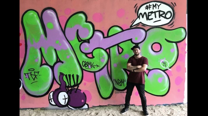
Metro gets a makeover